In Plain Words
A design token is a named variable that holds a single design decision. Instead of writing #1D4ED8 inside a button, a card, and a chart legend, you write color.brand.primary. The hex value lives in one place. When the brand color changes, every product that consumes the token follows.
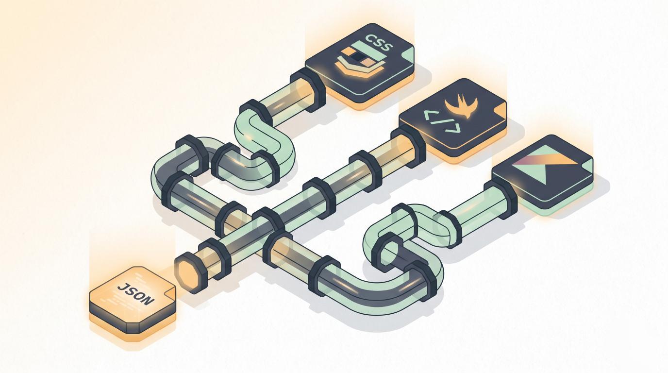
Tokens are usually authored as JSON, then transformed into whatever each platform actually understands: CSS custom properties for the web, Swift constants for iOS, Compose theme entries for Android, XAML resources for Windows. The JSON is the source of truth. Everything else is generated output.
How It Works
Most teams structure tokens in three layers. Each layer references the one below it.
| Layer | Also called | Example |
|---|---|---|
| Primitive | Global, base, reference | color.blue.500 = #1D4ED8 |
| Semantic | Alias | color.action.primary = {color.blue.500} |
| Component | Scoped | button.background = {color.action.primary} |
Primitives describe the palette without meaning. Semantic tokens give meaning (action.primary, surface.danger) so the same name can swap underlying values for light mode, dark mode, or a sub-brand. Component tokens are the last mile.
A token file in the W3C Design Tokens Community Group draft format looks like this:
{
  "color": {
    "blue": {
      "500": { "$value": "#1D4ED8", "$type": "color" }
    },
    "action": {
      "primary": { "$value": "{color.blue.500}", "$type": "color" }
    }
  }
}
A transformer such as Style Dictionary or Tokens Studio reads that file and emits the per-platform artifacts. The same input becomes --color-action-primary: #1D4ED8; in CSS and a Color.actionPrimary constant in Swift.
Why It Matters
Without tokens, design decisions get encoded as literal values scattered across stylesheets, component libraries, and native codebases. A rebrand turns into a grep job. Dark mode turns into a parallel stylesheet. Accessibility audits hit dead ends because no one knows which gray is the real body-text gray.
Tokens collapse that surface area into a single contract. Designers edit values in Figma variables. Engineers consume the generated output. The pipeline in between is boring on purpose. The payoff shows up in three places:
- Theming gets cheap. Light, dark, and high-contrast modes share token names but swap values.
- Cross-platform parity becomes mechanical. The web and the iOS app reference the same source of truth.
- Design system upgrades stop requiring a search-and-replace sweep across every product repo.
Origin
The term was coined inside Salesforce around 2014 by Jina Anne while building the Lightning Design System. The idea spread through the design-systems community over the next few years, and in 2021 the W3C Design Tokens Community Group formed to standardize the file format. Their draft specification is what most modern tooling now targets.
Common Confusions
| Design tokens are not | Because |
|---|---|
| CSS variables | CSS variables are one possible output. Tokens are platform-agnostic and compile to many targets. |
| Theme objects | A theme is a consumer of tokens, often per-mode. Tokens are the source. |
| Figma styles | Figma styles and variables can author tokens, but a style alone is not a token until it is exported as data. |
| A design system | Tokens are one layer of a design system, alongside components, documentation, and guidelines. |